Build a PSD to HTML/CSS in Dreamweaver
Learn how to design, slice and code your own Photoshop layout in Photoshop and Dreamweaver.
Slice
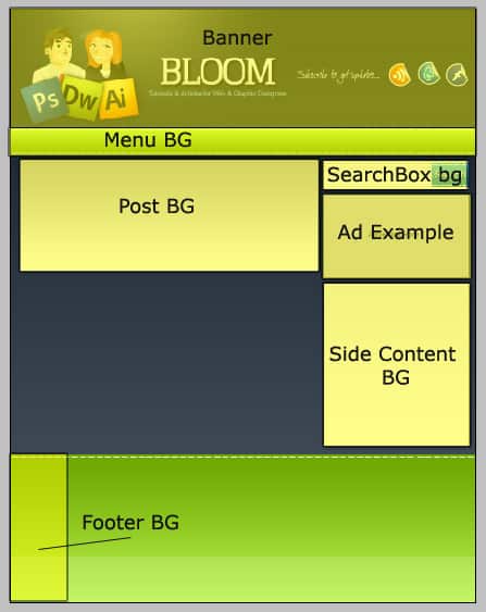
1. Open up the design in photoshop and remove the text (eg. Menu text, content text, sidebar text). We will be saving these sections of the layout:
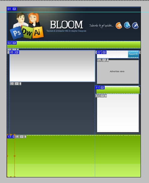
2. Grab the slice tool and slice the sections of the sections I have highlighted above. Next go into File > Save for Web & Devices. Once in the web & Devices new window double-click on each sliced image and name them to make it easy when you start coding. Next save the images as a PNG-24
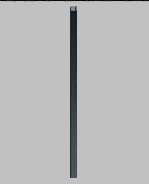
3. Next hide all the layers on the layout (by the eye icon on the layers) and leave the background. Grab the crop tool and crop the background and save an bg.gif.
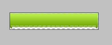
4. Next hide the background layer so it’s transparent and click on the category header.
5. I’ve decided to add an extra bits to the bottom of the category box using pen tool and color #598305. Next crop the sidebar header with the crop tool and save as a .png.
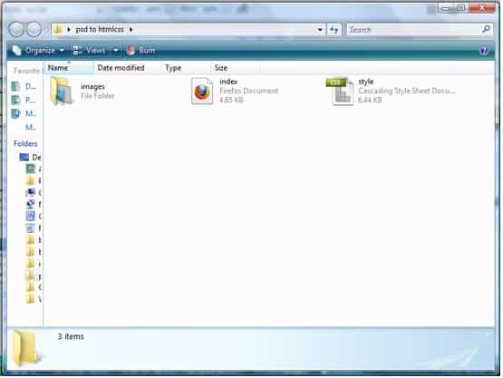
6. Create a new folder and name it whatever you like. Go into the folder and create another new file called images and put all of the images in the folder. You should have something like this:
Code
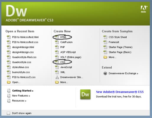
1. Open up dreamweaver (or notepad) and start a new css and html file.
2. Save the html document as index.html and the css document as style.css. Save them in the folder you created earlier. It should look like this:
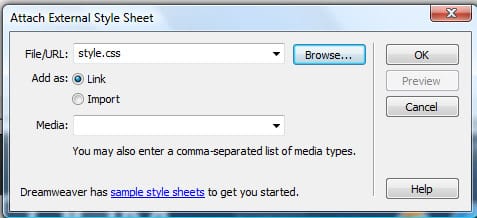
3. Go into the html file, make sure the right side panel is showing. Go into CSS, click on the link icon and attach the css file.
If you are using notepad use this code to attach the css file:
<link href="style.css" rel="stylesheet" type="text/css">
4. Now let’s start coding!, I will go through each section of the website starting from top to bottom and explain what each part does.
If using dreamweaver your html file will look like this:
<!DOCTYPE html PUBLIC "-//W3C//DTD XHTML 1.0 Transitional//EN" "http://www.w3.org/TR/xhtml1/DTD/xhtml1-transitional.dtd">
<html xmlns="http://www.w3.org/1999/xhtml">
<head>
<meta http-equiv="Content-Type" content="text/html; charset=utf-8" />
<title>Untitled Document</title>
</head>
<body>
</body>
</html>
Your website will go between the <body></body> tags.
CSS Basics
/*MAIN BODY STYLES */

* {
margin: 0px;
padding: 0px;
}

body {
background-image:url(images/bg.jpg);
background-repeat:repeat-x;
background-color: #48525e;
font-family:Verdana, Arial, Helvetica, sans-serif;
font-size:12px;
color:#333333;
}

 img {
 border: 0px;
}
Firstly open up the css file, put in this code below. The first bit of code is so the document won’t have any paddings or margins, doing this will allow everything to fit together nicely with no spaces in between (eg. the banner will be right at the top of the website).
The body of the website is basically the background, the font family you want on your website. I have attached my background image, and made it repeat-x so it repeats vertically on the page. I got the color from the bottom of the background and make it the background color so it blends in.
Lastly img means image, I’ve made the border 0px so when an image has a link, it won’t have that ugly blue border around it.
/* TEXT STYLES */

h1,h2 {
 color: #333333;
 font-weight: bold;
 font-family: Georgia, "Times New Roman", Times, serif;
 font-size: 16px;
 font-style: italic;
}
h1 {
 font-size: 24px;
 line-height: 34px;
 color: #333333;
}
h2 {
font-size: 18px;
line-height: 34px;
}
h3 {
color: #333333;
font-size: 18px;
line-height: 34px;
}
a:link {
 text-decoration: none;
}
a:visited {
text-decoration: none;
color: #309DCF;
}
a:hover {
 text-decoration: none;
 color: #FF6600;
}
a:active {
 text-decoration: none;
 color: #000000;
}
Next I like to do the text styles. The headings (h1, H2 etc) are first. H1 is the largest font then it goes to H3 or H4 which is the smallest font. Next I have the links text styles, anything that has an a: means link.
Banner
HTML Code
<div id="header">
<ul class="navigation">
<li> <a href="#">Home</a></li>
<li><a href="#">Page #1</a></li>
<li><a href="#">Page #2</a></li>
<li><a href="#">Page #3</a></li>
<li><a href="#">Page #4</a></li>
<li><a href="#">Page #5</a></li>
<li><a href="#">Page #6</a></li>
</ul>
</div>
Go into your html document, underneath the <body> tag put in this code. We place the div id, and name it header, we then close the div tag by putting in a closing bracket </div>. Next we want the top navigation to go inside the header, so we’ll write in <ul></ul> (which is an unordered list), we then place our navigation text in a list format <li></li> with a link.
There are 2 div tags:
Div ID: Is used for the main items on the website like, banner, wrapper, left content, right content, footer.
Div Class: Are used for the features inside the div ID’s (usually).
CSS Code
/* BANNER */

 #header {
 width: 900px;
 height: 197px;
 background-image:url(images/Banner.png);
 margin: 0 auto;
 }
/* TOP MENU */

.navigation ul {
margin: 0px;
padding: 0px;
}
.navigation li {
 list-style:none;
 display:block;
 float: right;
 color: #FFFFFF;
}
.navigation a {
 text-decoration: none;
 color: #FFFFFF;
 display: block;
 height: 17px;
 padding-right: 10px;
 padding-left: 17px;
 padding-top: 3px;
 font-family: Arial, Helvetica, sans-serif;
}

.navigation a:hover {
color: #FFFFFF;
background-image: url(images/nav_hover.png);
background-repeat: repeat-x;
}
For a Div ID we use the # symbol and when we want a Div Class we use a . beside the word. We use open and closed {} brackets and put all the info between them. For the header I’ve put the width and height of the banner, made the background header the banner image and made the margin: 0 auto; to centre the banner on the page.
Now for the navigation we need to style each element in the navigation, we type in .navigation and besides the text we put in:
ul: Style the unordered list
li: Style the list
a: Style the link (remember an a besides the word means link
a: hover: Style how it will look when the link is being hovered over
The <ul> padding and margin is 0 so there’s no ugly spacings. A list style of none removes the list dot on, making the display: block puts blocks around each link, and making the float: right makes the menu horizontal. Â To get spacing between the links, on the ‘a’ style and edit the padding settings and margin.
The best way to learn css would be to try editing the settings yourself so you can get a good understanding of what each style code can do.
Main Menu
HTML Code
<div id="mainmenu">
<ul>
<li><a href="#">Home</a></li>
<li><a href="#">About Us</a></li>
<li><a href="#">Portfolio</a></li>
<li><a href="#">Services</a></li>
<li><a href="#">Get a Quote</a></li>
<li><a href="#">Testimonials</a></li>
<li><a href="#">Contact Us</a></li>
</ul>
</div><!--end main menu-->
Now for  the main menu, add in this code. Again I’ve made the main menu a Div ID because it’s a main item and placed links again in the div id. I’ve ended the div with <!–end main menu–> try and end all div tags this way so it’s easier to edit later.
CSS Code
/*MAIN MENU */

#mainmenu  {
 background-image: url(images/menu.png);
 background-repeat: repeat-x;
 height: 51px;
 width: 900px;
 margin: 0 auto
}
#mainmenu li {
 font-family: Arial, Helvetica, sans-serif;
 color: #FFFFFF;
 list-style-type: none;
 display: block;
 float: left;
}
#mainmenu ul {
 margin: 0px;
 padding: 0px;
}
#mainmenu a {
 text-decoration: none;
 display: block;
 font-size: 14px;
 color: #FFFFFF;
 height: 19px;
 margin-right: 25px;
 margin-left: 25px;
 margin-top: 18px;
}
Here’s the css. I’ve place the li, ul and a besides the #mainmenu to edit each part of the menu. The #mainmenu is basically for the background, width and height. The margin settings on the ‘a’ style is so the menu text sits evenly in the middle on the menubar.
CONTENT LAYOUT POSITIONS
HTML Code
<div id="wrapper">
<div id="left"></div><!--end left-->
<div id="right"></div><!--end right-->
</div><!--end wrapper-->
The wrapper is basically like a contain and will hold all the content inside it, next is the left content and right content.
CSS Code
/* CONTENT LAYOUT PLACEMENTS */

#wrapper {
 width: 900px;
 margin: 0 auto;

}

#left {
 width: 600px;
 height: auto;
 float:left;
}
#right {
 width: 300px;
 height: auto;
 float: right;
}
Now for the css, I’ve made the wrapper the same width has the header and made it centered. Next is the left, I’ve made the height: auto because the content will go it, and made it float left. The width is 600px so the main content will go in. Next is the right, I’ve make sure the width of the right and left doesn’t equal over 900px or else the layout won’t fit together snug, I’ve made the width 300px and made it float right.
Footer
HTML Code
<div id="footer">
</div><!--end footer-->
Place this code outside of the wrapper.
CSS Code
/* FOOTER */

#footer {
 clear: both;
 width: 100%;
 background-image: url(images/footerbg.png);
 background-repeat: repeat-x;
 height: 286px;
}
Now for the css code, I’ve put clear: both; this will make the footer clear all the content and sit on the bottom of the page. I’ve made the width 100%Â and set the background repeat to repeat-x, to make it horizontal. I’ve set the height of the footer the same height as the image.
Post
HTML Code
<div><!--post starts--><div><img src="images/postimage.jpg" alt="Test Image" width="220" height="180" /></div><div><h1>This is a post title...</h1></div><div><p>Posted by Admin on 27/10/10 | <a href="#">14 Comments</a></p></div><div><p>Sample Text Here.</p></div><div><p><a href="#">Continue Reading</a></p></div></div><!--post ends-->
Here is the right content code, I’ve named each post element so it’s easy for you to understand what each feature is.
CSS Code
/* POST STYLE */

.post {
 background-color: #FFFFFF;
 background-image: url(images/postbg.png);
 background-repeat: repeat-x;
 width: 580px;
 float: left;
 margin-bottom: 20px;
 padding-top: 10px;
 padding-right: 10px;
 padding-bottom: 10px;
 padding-left: 10px;
 margin-top: 5px;
}
.post h1{
 color: #309DCF;
 font-size: 24px;
 font-weight: bold;
 line-height: 34px;
 width: 580px;
}
.post img{
border: 1px solid #d4d4d4;
padding: 5px;
float: left;
}
.post-img {
 float: left;
 height: 198px;
 width: 234px;
 margin-right: 10px;
 margin-bottom: 10px;
}
.post-details {
 width: 335px;
 float: right;
 padding-top: 5px;
 padding-bottom: 5px;
}
.post-details p {
 font-family: Verdana, Arial, Helvetica, sans-serif;
 font-size: 10px;
 color: #ef8e04;
 font-weight: 400;
}
.post-details a {
 color: #0099CC;
 font-family: Verdana, Arial, Helvetica, sans-serif;
 font-size: 10px;
 font-weight: 400;
}
.post-title {
 float: left;
 width: 336px;
}
.post-title h1 {
 font-family: Georgia, "Times New Roman", Times, serif;
 font-size: 24px;
 font-style: italic;
 color: #333333;
}
.post-title p {
 background-color: #90c6df;
 float: left;
}
.post-desc {
float: left;
width: 336px;
text-align: justify;
font-style: italic;
line-height: 16px;
}
The .post is basically the container for the post, I’ve set the width, background image & color, and floated it left. I’ve set the padding so the content in the box sits nicely in the middle and made the margin-bottom: 20px and top 5px so when there’s more then one post they’re evenly apart from each other. .
Post img: Is how the image will look on the post
Post-img: Is where the image will be in the post box
Post details: Is where the details will be placed
Post Title: Is where the title will be placed
Post-Desc: Is where the description will be placed
The rest of the css code it either the link type (a), or text type (p,h1)
SIDEBAR
HTML Code
<div class="side-bar><!--sidebar starts-->
<div align="center">
<a href="#"><img src="images/ads.jpg" alt="Your AD Here" /></a>
</div>
<div class="side-bar-content">
<h1>Some Text</h1>
<p> make a type specimen book.</p></div>
<div class="side-bar-content>
<h1>Categories</h1>
<ul>
<li><a href="#">Categorie #1</a></li>
<li><a href="#">Categorie #2</a></li>
<li><a href="#">Categorie #3</a></li>
<li><a href="#">Categorie #4</a></li>
<li><a href="#">Categorie #5</a></li>
</ul>
</div>
</div></div><!--sidebar ends-->
Go into the Right container and copy in the sidebar html code. The sidebar will contain our search box, advertising, Categories and any other info we need. The side-bar will bascially be the wrapper of the side-bar-content.
CSS Code
.side-bar {
 margin: 0 auto;
 width: 290px;
}
.side-bar-content {
 width: 260px;
 margin-top: 5px;
 margin-right: 15px;
 margin-bottom: 8px;
 margin-left: 15px;
 background-color: #FFFFFF;
 border: 0.25px none #333333;
 background-image: url(images/cat_body.png);
 padding-top: 5px;
 padding-right: 5px;
 padding-bottom: 5px;
 padding-left: 10px;
 }
.side-bar-content h1 {
 font-family: Verdana, Arial, Helvetica, sans-serif;
 font-size: 16px;
 font-style: italic;
 font-weight: 400;
 color: #333333;
 background-image: url(images/headerbg.png);
 text-indent: 20px;
 height: 50px;
 width: 283px;
 padding-top: 5px;
 margin-left: -11px;
 background-repeat: no-repeat;
}
.side-bar-content li {
 list-style-type: none;
 margin-left: 15px;
 padding-bottom: 5px;
}
.side-bar-content a {
 font-family: Verdana, Arial, Helvetica, sans-serif;
 font-size: 14px;
 font-style: italic;
 color: #333333;
}
The side-bar will contain the side-bar-contents, I’ve made the width smaller then the Right Column and centered it. Next I’ve set the width, background-image and some margins and padding’s to .side-bar-content. Next I’ve put a background on the H1 by fiddling around with width, height, margin, padding and text indent. Finally edit the list and link style.
SEARCH BOX
HTML Code
<!-- begin search box -->
 <div>
 <form action="<?php echo get_option('home'); ?>/">
 <input type="text" name="s" id="s" value="" />
 <button type="submit">Go</button>
 </form>
 </div>
 <!-- end search box -->
Copy and paste this code onto the side-bar.
CSS Code
/* SEARCH BOX */

.box form {
 width: 282px;
 height: 55px;
 margin-top: 5px;
 margin-right: auto;
 margin-bottom: 0px;
 margin-left: auto;
 background-image: url(images/search.jpg);
 background-repeat: no-repeat;
 background-position: 0 0;
 }
.box form input {
 float: left;
 width: 195px;
 font-size: 10px;
 font-family: Verdana;
 border: 0;
 background-color: transparent;
 margin-top: 15px;
 margin-right: 0;
 margin-bottom: 0;
 margin-left: 10px;
 height: 30px;
 }
.box form button {
 border: 0;
 width: 69px;
 height: 35px;
 text-indent: -9999px;
 background-color: transparent;
 margin-top: 20px;
 float: right;
 }
The Box Form holds the background image of the search box, the height and width and margins of where the search box will be placed. The box input is where the text will be type in on the box and the box form button will be where the button should be placed, the text form and buttom we’ll be invisible on the website so the search box will only be seen.
FOOTER INFO
HTML Code
<div id="footercentre">
<div id="box">
<h1>Get a Quote</h1>
<p>Want to submit your article, tutorial or review to Bloom Web Design?</p>
<p>Become an Author</p>
<p>Sample Text</p>
p>Submit a Link</p>
</div>
<div id="box">
<h1>Get a Quote</h1>
<p>Get a quote in 24hrs!</p>
</div>
<div id="box">
<h1>About Us</h1>
<p>About Us info Here</p>
</div>
</div>
<div id="copyright">
<p>© Copyright 2010 Bloom Web Design. All Rights Reserved. Powered by WordPress 3.0 </p>
</div>

Copy and paste this into the Footer.
CSS Code
#box {
 width: 250px;
 margin-left: 40px;
 float: left;
 margin-top: 20px;
 margin-bottom: -20px;
}
#box h1 {
 font-family: Geneva, Arial, Helvetica, sans-serif;
 color: #333333;
 font-size: 16px;
}
#box p {
 font-size: 12px;
 font-family: Arial, Helvetica, sans-serif;
 color: #FFFFFF;
}
#copyright {
 clear: both;
 width: 900px;
 margin-top: 35px;
 margin-right: auto;
 margin-left: auto;
 margin-bottom: 0px;
}
#copyright p {
 font-family: Arial, Helvetica, sans-serif;
 font-size: 12px;
 color: #666666;
 text-align: center;
}
#footercentre {
 width: 900px;
 margin: 0 auto;
 height: 200px;
}
The #footercentre will centre all the content in the footer, I’ve made the width 900px (like the header) made the height 200px and centered it.
The box will hold the details, I’ve made the width 250px, configured the margins to make it fit nicely in the footer and set it to float: left so the 3 boxes will sit horizontally and edited the text in the box (p and h1).
Finally for the copyright part of the footer I’ve added #copyright with a clear: both so it stays on the bottom of the page, set the width to 900px and centered it using margins. I’ve made another #copyright p to edit the text in the copyright section.
