The Importance of Good User Experience for Student Enrolment

We’re living in an increasingly tech-savvy world and school’s need to implement an education marketing strategy to match up. Both prospective students and their parents have an understanding of how websites should function for them to have a smooth and easy experience. If your school’s website is offering a poor user experience you can seriously risk losing student enrolments to your competition.
The importance of good user experience for student enrolment really can’t be underestimated. By understanding this, and how to implement it effectively, you can increase registrations and applications to stay ahead of the competition.
What is user experience?
Put simply, user experience is everything that is concerned with how somebody navigates a website. While that may sound overwhelming, it’s easy to see how it can be improved when you view it from your own perspective. You must have come across websites that have information that is hard to find, or maybe the page was slow to load, for example. These are classic cases of poor user experience. Implementing good user experience is all about making sure your website is intuitive and easy to use for any user.
To break it down, user experience design has three main components:
Research
If you’re looking to overhaul any part of your website for better user experience, a good amount of research is needed to ensure your changes will be effective. There are a number of research methods you can use:
- Look at your competitor’s websites. Ask yourself: what are they doing visually and content-wise that you could also be doing? Is there anything you could improve upon on your own website?
- Conduct surveys on what your target audience wants to see
- Develop personas of your ideal prospective student so you know exactly what your target audience is looking for in a website.
- Use existing user data from your site. Check your bounce rate to see how long users are staying on your site before they leave.
No matter your methods, as long as you have valuable data that can guide your user experience then you’re good to get started.
Design
Changing the design of your website for user experience can mean going into the backend of your website to make these changes. A lot of content management systems like WordPress or Wix can make it easy for anyone to make visual changes to your website. If you aren’t confident with making those changes then you’ll need to work with a web developer to make any permanent changes to your website.
User Testing
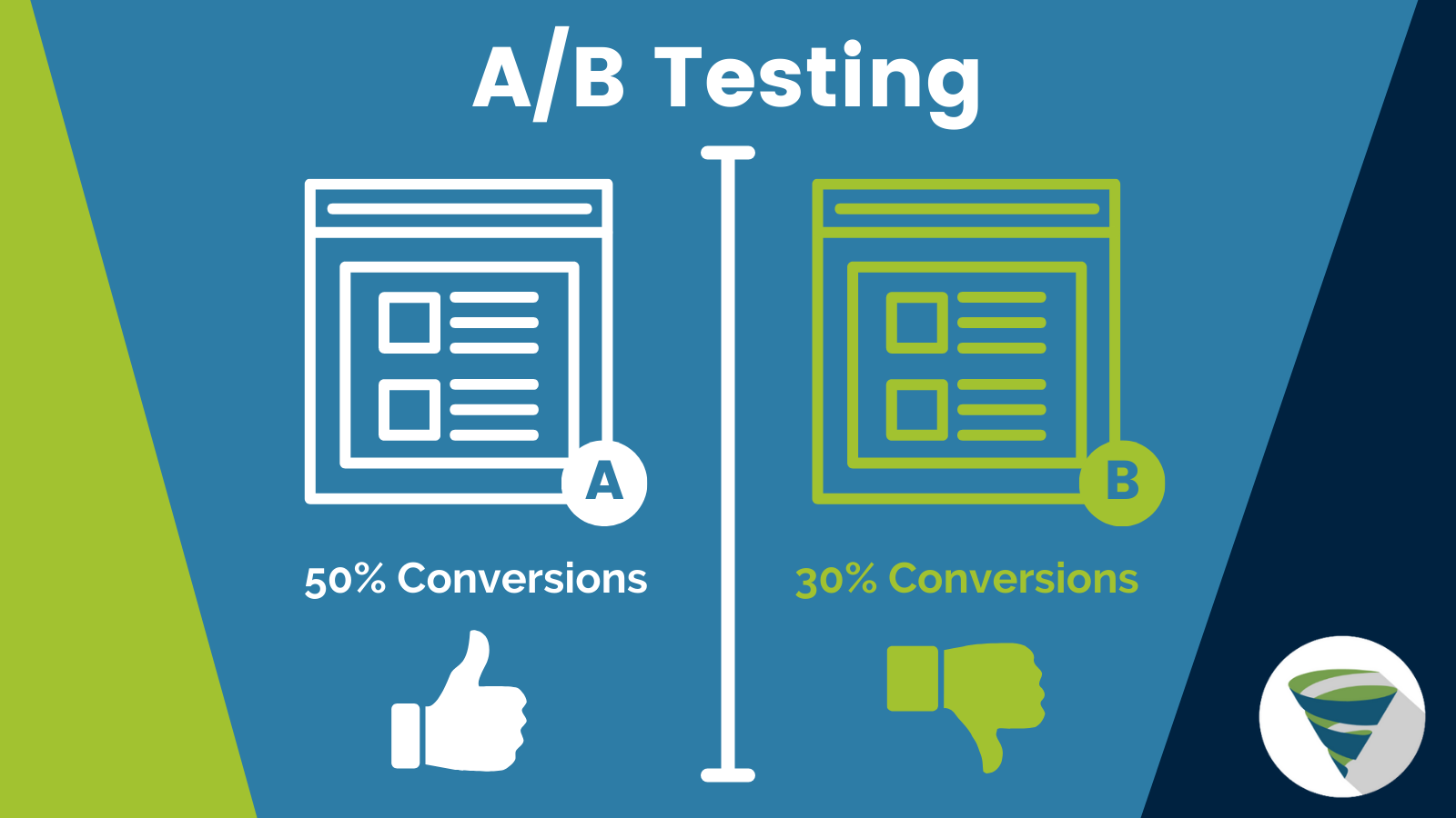
How A/B Testing works
It’s all well and good having a ton of design changes that could boost your student enrolments but there’s never a guarantee that it will. This is where testing comes in. A/B testing is a very popular method where you test two versions of the same page. Over a period of time (could be weeks or months), you’ll collect data on which version users respond more positively to. By doing this process for user experience changes, you’ll know for sure which page you should present to all website visitors.
Increasing student enrolments with good user experience
When you’re building landing pages to help increase student enrolment you need to be thinking about the bigger picture. For many prospective students the amount of information they need to feel confident in making the decision to enroll. From easy to find bus timetables, open day dates, course information and so on. Make sure your website displays information that’s easy to digest and makes a student much more likely to enroll. You can make simple design decisions that can make the user experience a breeze:
Common visual queues
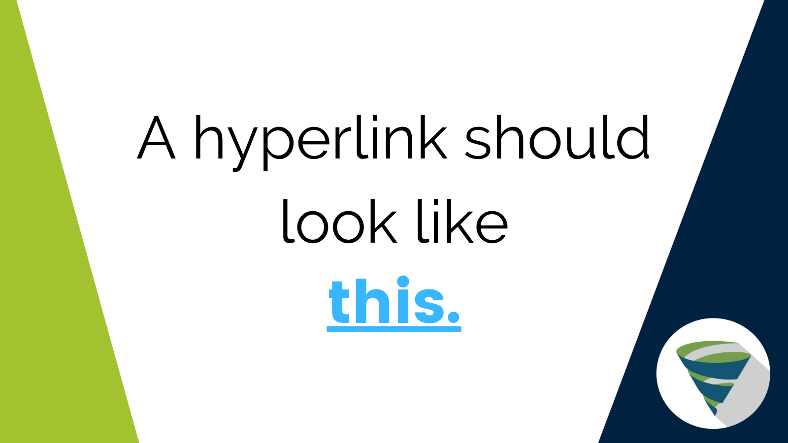
Example of how hyperlinks commonly appear online
It may seem like common sense but there are many visual queues that are universally understood that can be easy to forget when building your website. For example, a hyperlink will stand out from the standard body of text by making it bold, underlined and its own unique color.

Example of a downward arrow indicating a drop-down menu
Other established conventions like downward arrows to indicate additional information or a drop-down menu or a magnifying glass next to the search bar are easy ways of helping the user to navigate your site. When looking to increase student enrolments for your school sites, using these common signs will help build their trust in your institution and help them find the information they need to convince them to enroll.
Using images effectively
An image can really make your landing page stand out, while presenting the exact message or brand identity you’re looking to convey. Not only that but they also break up large blocks of text, making the content on your site much easier to digest. When prospective students are looking to enroll they’ll want to see people their age on campus as well as the campus itself. When paired with great page copy, the use of great images can bring out the message of your page instantly just by looking at it.
Constantly making changes
Through your research, you’d have developed your ideal prospective student persona. This means you’ll be able to make relevant changes to your website to suit your target audience. There will always be new design trends that can be even more effective at increasing student enrolment than any previous strategy. Always keep on top of the latest strategies and keep testing to see what works best for your school’s site.
Author Bio: James Sayers has a passion for writing on media such as music, film and video games. He works at Tillison Consulting as an SEO Campaign Manager working on blog content and SEO improvements for clients.


