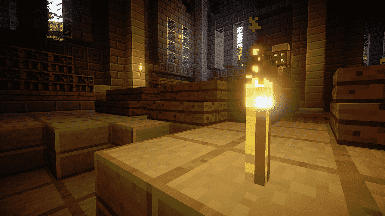
What Can Video Games Teach Us About Good Design?
Game design may feel very much like its own unique discipline that stands apart from other design practices and processes, but in reality there is a lot to learn from the way that the best developers overcome challenges and engage players.
With that in mind, here is a look at the main lessons to take away from the gaming industry and why they are relevant to the wider world of design.

Image Source: Pixabay
The interface layout is everything
Whether you are working on a website, a mobile app or even a traditional print ad, you need to think carefully about the way key elements are positioned in order to appeal to your target audience on an aesthetic level while also being functional.
This is something that good game designers know instinctively, hence why UI layout can be the difference between an average experience and an exceptional one.
From the logical and clear way that a game like Hearthstone highlights important information to players based on its relevance from moment to moment, to the effectiveness with which online blackjack experiences are able to translate established formats to the digital realm, well orchestrated UIs are a thing of beauty.
Conversely it is also possible to see what not to do in terms of interface layout by studying games that get it wrong. Grand Theft Auto V is a good example of a hugely successful and critically acclaimed game which nevertheless suffers from an interface and menu system that is convoluted at best, and frustrating at worst. Likewise games which aim to appeal to players across as many platforms as possible often have to make compromises with UI design, as evidenced by Skyrim’s controller-friendly interface that left PC players fuming.
Simplicity is not the same as simplistic
It is often argued that simpler is better in a design context, and yet lots of people interpret this to mean that they should aim to create simplistic things. In reality, the aim should be to opt for elegance and intuitiveness through accessibility, without making compromises that leave the end results looking childish or half-baked.
An excellent example of how something simple can deliver surprising depth is the combat system in sprawling, indie action-adventure stalwart Hollow Knight. Unlike some other pseudo-RPGs, which tend to have myriad weapons and upgrade paths for the player to choose between, this 2017 sleeper hit has just one. Rather than this being a limiting factor, it is instead an opportunity for the designers to make this one key element of the game as polished and satisfying as possible.
The lesson is that just because you can cram in as much content or creative flourishes as possible, it doesn’t mean that you should. Nor should you neglect a seemingly simple aspect of a design because it is so basic or fundamental.
Perseverance is important
A broader lesson that video games can teach us about good design is that the game itself can be the thing which motivates continued engagement, with the promise of achieving something meaningful further down the line being enough to justify enduring the setbacks that happen along the way.
For everyone from web designers and graphic designers to developers and beyond, the idea of encouraging an attitude of perseverance when tackling projects should be seen as a valuable one. Likewise if the project itself can benefit from gamification, then a closer conformity with the frameworks that define modern video game experiences will be sensible.
Designers across all fields can learn from one another, and good designers know that opportunities to grow and improve are available everywhere as a result.


