5 Key Trends Shaping Web Design Right Now
Powerful web design is all about creating a user experience that is second to none, and as consumer habits continuously change, the art lies in staying ahead of the curve. Keeping up in such a fast-paced industry is undoubtedly a challenge, so to provide the most up-to-the-minute design inspiration, we took a look at some of the web design trends that are set to dominate creative web design in the near future.
1.Material Design
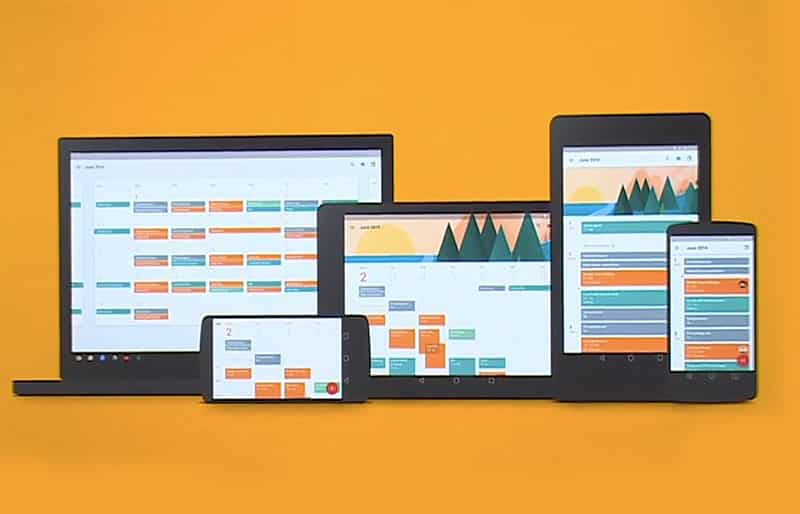
A design language developed by Google, Material Design aims to combine “the classic principles of good design with the innovation and possibility of technology and science.â€

In technical terms, Material Design is an extension of Flat Design, focusing on grid-based layouts and responsive animations to achieve ultimate simplicity.
In design terms, this translates into vibrant colors, 3D effects such as shadows, elevations and stacking, clear typography, and defined spacing. Developed to enable a uniform experience regardless of device or screen size, the rise of Material Design reflects the increasing importance of mobile and will no doubt play a crucial role in future web design. Check out the Material Design Blog for further inspiration.
2.Chatbots
Personalization has long been hailed as the key to powerful brand-user interactions, and the advent of chatbots is set to bring this to web design.

While web design has traditionally focused on creating one interface that appeals to as many users as possible, the integration of chatbots is giving designers the opportunity to interact on a more personal level.
As web designer Adrian Zumbrunnen discovered when he built a chatbot into his personal website, this up-and-coming technology enables designers to convey their character and personality in a way that was not previously possible. In this respect, conversational interfaces could well replace – or at least accompany – traditional navigational menus, guiding the user around the site depending on their requests.
3.Web Brutalism
More of an anti-trend, so-called web brutalism goes against the grain of what is widely recognized as “good†web design.

Whether it’s from-scratch coding or through ready-made WordPress themes such as these, the end goal is usually the same: to create high-performance sites that are both visually pleasing and user-friendly.
These aims are often achieved by using solid WordPress themes because they’re designed with UX in mind; however, the brutalist movement caters to neither of these things, and is identifiable by its disregard for these established practices.
While it’s unlikely that brands will adopt such an approach for their own websites any time soon, web brutalism recently went viral thanks to brutalistwebsites.com, a portfolio of sites that were created as a “reaction by a younger generation to the lightness, optimism, and frivolity of today’s web design.â€
4.Cinemagraphs
Similar to GIFs, cinemagraphs enable motion storytelling through animated images. As designers constantly seek to strike the perfect balance between fast-loading, high-performance pages and aesthetically pleasing visuals, cinemagraphs are quickly becoming an essential part of any webmaster’s toolkit.

Cinemagraphs are significantly smaller than videos in terms of their data file size, they integrate similarly to photos whilst providing a little more visual excitement. What’s more, they perform just as well on mobile and, with cross-device versatility a major factor, we will no doubt be seeing a lot more of the cinemagraph in future web design.
5.Microinteractions
Microinteractions represent a major trend in UX (user experience) and thus are now a crucial component of modern web design.

Microinteractions describe the small but significant ways that users engage with various devices and interfaces – anything from turning off an alarm on your phone to liking a post on social media.
As user experience remains at the forefront, designers will increasingly consider these tiny actions when creating websites. As a design element, microinteractions use visual cues to highlight changes made by certain user actions and guide the user to keep interacting with the site.
Although seemingly inconsequential, well-designed microinteractions contribute to a smooth user journey and will increasingly serve as a marker of exceptional web design.
Final Thought on Emerging Web Design Trends
There you have it, five key web design trends shaping creative design right now. Producing great content and visuals for the web while providing intuitive user experiences and fluid navigation are design challenges that are always in a state of flux.
The challenge for web designers in this fast paced industry is to remain innovative without compromising on quality and performance. These five new trends should give all creative designers something to think about.


