Design a Social Networking Site Layout in Photoshop
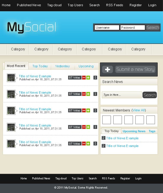
Learn how to design a sleek & sophisticated Social Networking Site in Photoshop!
Final Result
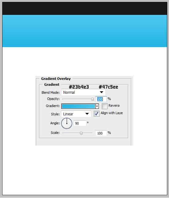
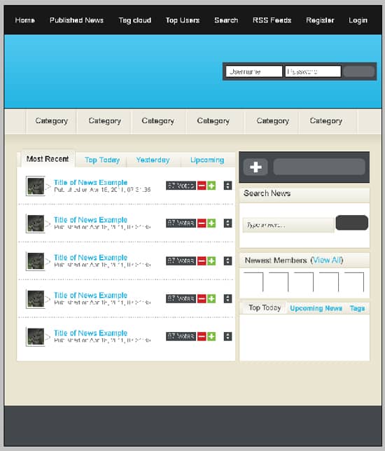
1. Create a new document that’s 900×1050 pixels. Get the rectangle tool and draw 2 rectangles like below. Make the first rectangle a dark grey, on the second rectangle double click into Blending Options > Gradient Overlay & put in the colours I have below:
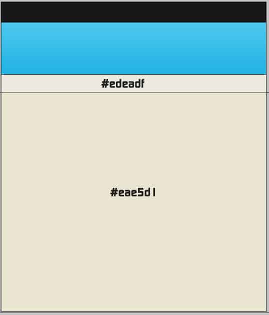
2. Create two more shapes using the rectangle tool a, one for the menu, and the other for the background. Make them the colours below:
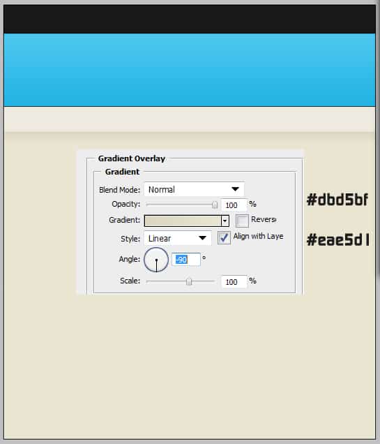
3. Draw another smaller rectangle shape right under the menu. Double click into Blending Options > Gradient over and put in the colours below. This will give a nice shadow effect.
4. Next get the line tool, hold down the shift key (this will make it straight) and draw 2 lines along the page like below. Make the top line black, and the bottom line white.

5. Using the rectangle tool draw a rectangle shape like below, double click into Blending Options and put the following settings in.
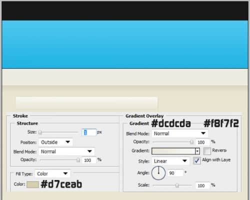
6. Draw another shape using the rectangle tool like below, double click into Blending Options and put in the following settings.
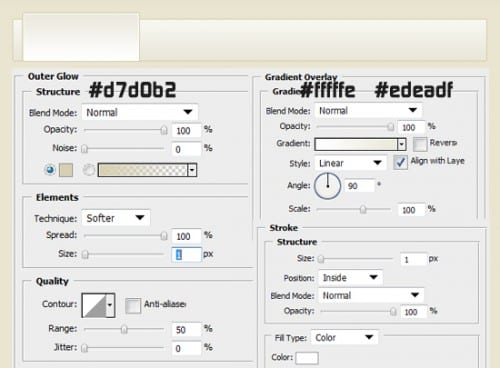
7. Again draw another shape (white) with the rectangle tool, double click into Blending Options > stroke and put the settings below:
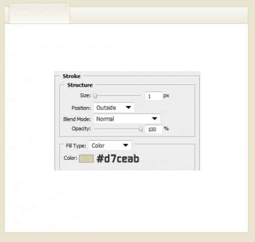
8. Next I’ve duplicated some of the shapes I previously made by dragging them to the new layer icon. I’ve shrunk down the shapes by press ctrl+t to make the transformable, holding down the shift key drag a top corner down to shrink (if you want the shape to stay perfect).
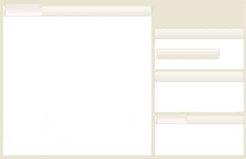
9. Using the line tool, hold down the shift key and draw a line on the main ‘tab’ window we drew. With the line layer selected press Add Layer Mask. Click on the new white square on the layer, get the eraser and erase the top of the line.
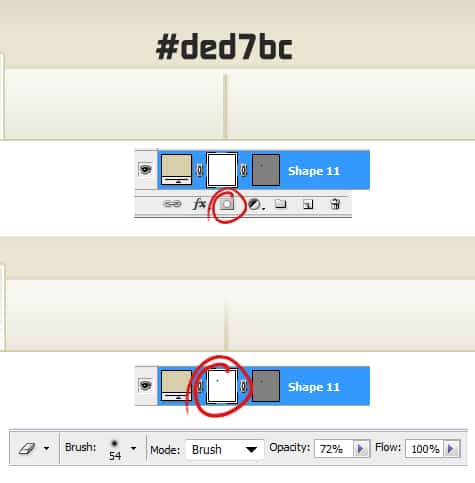
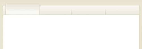
10. Draw the line to the new layer icon to duplicate and put them along the tab. These will be menu dividers.
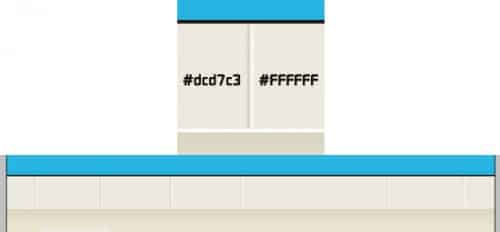
11. Next go to the menu area, get the line tool again and draw 2 lines like below. Duplicate the 2 lines and spread them out evenly.
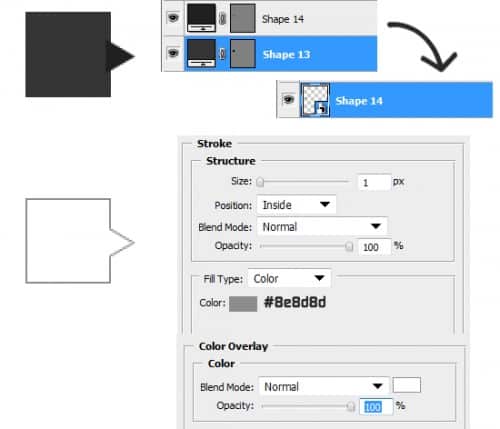
12. Now for the profile avatar, draw a rectangle, then go into Custom Shape Tool and choose the triangle shape. Rotate the triangle by press ctrl+t and rotating. Hold down the shift key and select the 2 shapes, right click and Convert to Smart Object. Double click into blending options and put in the settings below:
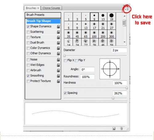
13. Now for the dotted line that will divide each post. Go into Window > Brushes (of F5). Put in the settings I have below, after click on the icon I’ve circled and save the brushes as dots.
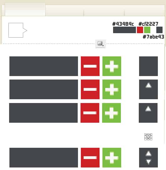
14. Using the rectangle tool draw shapes like below for the buttons on the side of the each post. Draw a minus & plus using the rectangle tool. Go into Custom Shape Tool & select the triangle tool and draw 2 white triangles. On second arrow press ctrl+t and rotate to point to the bottom.
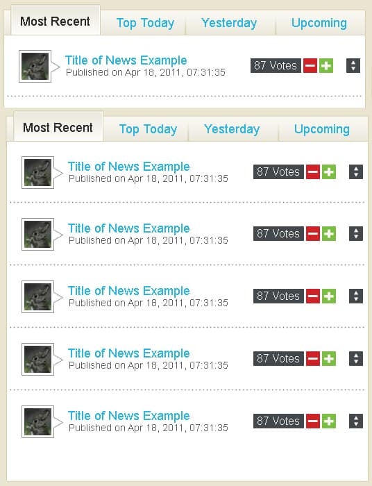
15. Write out some post information, I’ve used the font Arial in various ways. Duplicate the post & line dividers like below.
16. Using the rectangle/rounded rectangle tool draw a login box & button, and a box on the sidebar like below. Using the font Arial write our the top menu links.
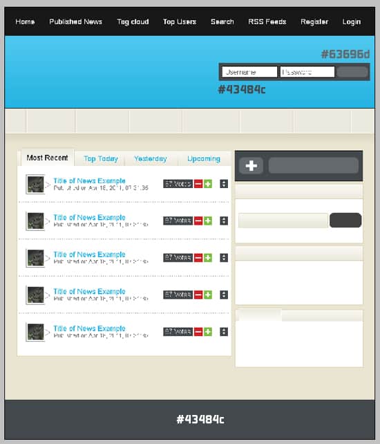
17. Next draw the second menu links & headings on the sidebar using the font Arial. With the rectangle tool hold down the shift key & draw a small box, double click into Blending Options and make it a 1px dark grey stroke.
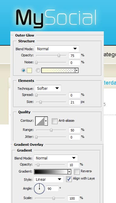
18. Using the font Continuum write out the name of the website, double click into Blending Options and put in the settings below:
19. Lastly write out the footer information in Arial font.


