Create Pure CSS3 Progress Bars Tutorial
In today's tutorial we'll learn how to Create Pure CSS3 Progress Bars with elegant colors and gradients all with CSS3. A progress bar is a component in a graphical user interface used to visualize the progression of an extended computer operation, such as a download, file transfer, or installation. Sometimes, the graphic is accompanied by a textual representation of the progress in a percent format.
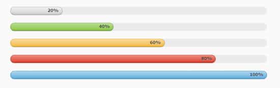
Progress Bars can be a fantastic tool to learn when you're wanting to impress a client of want to have a Progress Bar element on your website, today we'll break down how to code Pure CSS3 Progress Bars using HTML and CSS3. This Progress Bars are colorful and professional looking, complete with percentage numbers. Special thanks to Multi-colored Progress Bars.
HTML
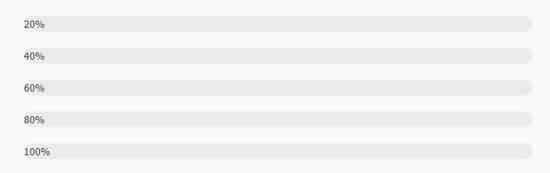
First we'll start with the basic html structure. The progress bars will be <div> with a meter of 'progress'. This will act as the filled area of the progress bar. This is set with a span style containing the width: 20%. We'll be creating 5 varied colored progress bars. To make each progress bar a certain color add in a color name in the <span style>. The progress bars are surrounded my a <section class> to act as the container.
  <section class="container">

    <div class="progress">

      <span style="width: 20%;"><span>20%</span></span>

    </div>


    <div class="progress">

      <span class="green" style="width: 40%;"><span>40%</span></span>

    </div>


    <div class="progress">

      <span class="orange" style="width: 60%;"><span>60%</span></span>

    </div>


    <div class="progress">

      <span class="red" style="width: 80%;"><span>80%</span></span>

    </div>


    <div class="progress">

      <span class="blue" style="width: 100%;"><span>100%</span></span>

    </div>

  </section>
MIT License
CSS
Let's start by positioning the progress bar. Under the container class add in a margin: 50px auto; to center them slightly to the left with the width. Next we'll add in a margin-bottom: 20px under the container class <div> tag, this will space out the progress bars.
.container {

  margin: 50px auto;

  width: 640px;

}

.container > div {

  margin-bottom: 20px;

}
.progress {

  height: 20px;

  background: #ebebeb;

  border-left: 1px solid transparent;

  border-right: 1px solid transparent;

  border-radius: 10px;

}
.progress > span {
  position: relative;
  float: left;
  margin: 0 -1px;
  min-width: 30px;
  height: 18px;
  line-height: 16px;
  text-align: right;
  background: #cccccc;
  border: 1px solid;
  border-color: #bfbfbf #b3b3b3 #9e9e9e;
  border-radius: 10px;
  background-image: -webkit-linear-gradient(top, #f0f0f0, #dbdbdb 70%, #cccccc);
  background-image: -moz-linear-gradient(top, #f0f0f0, #dbdbdb 70%, #cccccc);
  background-image: -o-linear-gradient(top, #f0f0f0, #dbdbdb 70%, #cccccc);
  background-image: linear-gradient(to bottom, #f0f0f0, #dbdbdb 70%, #cccccc);
  -webkit-box-shadow: inset 0 1px rgba(255, 255, 255, 0.3), 0 1px 2px rgba(0, 0, 0, 0.2);
  box-shadow: inset 0 1px rgba(255, 255, 255, 0.3), 0 1px 2px rgba(0, 0, 0, 0.2);
}
Now let's style the text on the progress bars under .progress >span >span.
.progress > span > span {

  padding: 0 8px;

  font-size: 11px;

  font-weight: bold;

  color: #404040;

  color: rgba(0, 0, 0, 0.7);

  text-shadow: 0 1px rgba(255, 255, 255, 0.4);

}
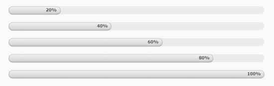
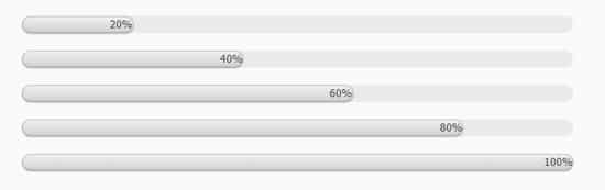
Lastly let's add in the colors to progress bar! This can easily done by adding a class name of green, red or blue. Make sure they match the <span class> name of the progress bars in the html structure. Some nice Gradients and border colors have been added in to create the colors. Have some fun!
.progress .green {

  background: #85c440;

  border-color: #78b337 #6ba031 #568128;

  background-image: -webkit-linear-gradient(top, #b7dc8e, #99ce5f 70%, #85c440);

  background-image: -moz-linear-gradient(top, #b7dc8e, #99ce5f 70%, #85c440);

  background-image: -o-linear-gradient(top, #b7dc8e, #99ce5f 70%, #85c440);

  background-image: linear-gradient(to bottom, #b7dc8e, #99ce5f 70%, #85c440);

}

.progress .red {

  background: #db3a27;

  border-color: #c73321 #b12d1e #8e2418;

  background-image: -webkit-linear-gradient(top, #ea8a7e, #e15a4a 70%, #db3a27);

  background-image: -moz-linear-gradient(top, #ea8a7e, #e15a4a 70%, #db3a27);

  background-image: -o-linear-gradient(top, #ea8a7e, #e15a4a 70%, #db3a27);

  background-image: linear-gradient(to bottom, #ea8a7e, #e15a4a 70%, #db3a27);

}

.progress .orange {

  background: #f2b63c;

  border-color: #f0ad24 #eba310 #c5880d;

  background-image: -webkit-linear-gradient(top, #f8da9c, #f5c462 70%, #f2b63c);

  background-image: -moz-linear-gradient(top, #f8da9c, #f5c462 70%, #f2b63c);

  background-image: -o-linear-gradient(top, #f8da9c, #f5c462 70%, #f2b63c);

  background-image: linear-gradient(to bottom, #f8da9c, #f5c462 70%, #f2b63c);

}

.progress .blue {

  background: #5aaadb;

  border-color: #459fd6 #3094d2 #277db2;

  background-image: -webkit-linear-gradient(top, #aed5ed, #7bbbe2 70%, #5aaadb);

  background-image: -moz-linear-gradient(top, #aed5ed, #7bbbe2 70%, #5aaadb);

  background-image: -o-linear-gradient(top, #aed5ed, #7bbbe2 70%, #5aaadb);

  background-image: linear-gradient(to bottom, #aed5ed, #7bbbe2 70%, #5aaadb);

}


