Design a Forum Skin in Photoshop
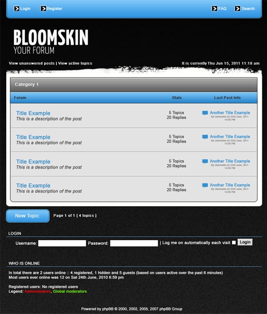
Learn how to design a grungy phpBB Forum skin in Photoshop.
I have made the layout structure similar to other phpBB Forum Skins out there so it’s easy to turn into a working forum skin.
Final Result

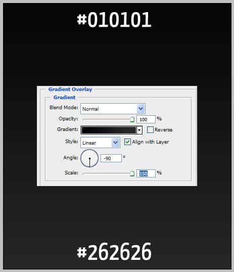
1. Create a new document that’s 900×1050, double click on the background layer to unlock it. Double click the layer again to go into Blending Options then Gradient Overlay and put in the following:
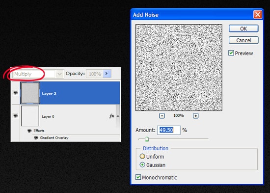
2. Create a new layer by click on the new layer icon & set the blending mode to Multiply. Then go to Filter > Noise > Add Noise and put in the following (or to your liking).
3. Next using the rounded rectangle tool draw a top bar, place the shape so the top is hidden like below. I haven’t written out any colour codes, I’ve left the choice up to you.
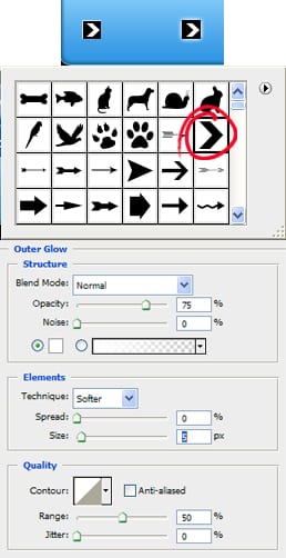
4. Using the rectangle tool, hold down the shift key (to keep the shape perfect) and draw a small square. Double click the square layer to go into Blending Options > Outer Glow and put in the following:
Next go into the Custom Shape tool and select the arrow shape & draw a small white arrow while holding down the shift key.
5. Next put in your forum name and slogan, and some forum details in Arial > Regular > 12pt > None.

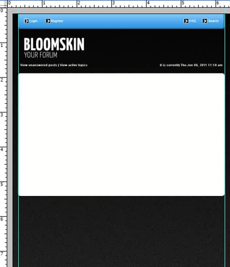
6. Next press ctrl+r to bring up rulers around the canvas, drag out 2 lines from the rulers and place them on the edge of the top bar. Using the rounded rectangle tool & the using the lines as a guide draw a white box for the forum.
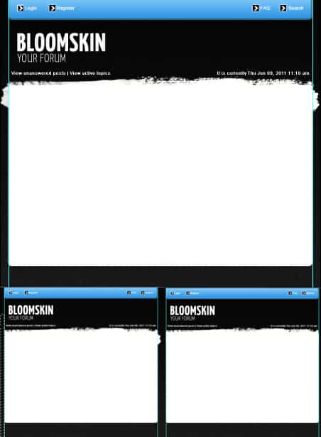
7. Using Horizontal brushes from Grunge Paint Stroke Brush Set  create a new layer and paint like below, so the top looks grungy. Using the blue lines as a guide, highlight and remove the overlapping edges of the brush with the rectangular marquee tool.
To remove the guide lines drag them off the canvas using the Move Tool (V).
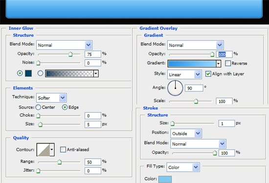
8. Next draw the shape below using the rectangle tool, double click into Blending Options and put in the following:
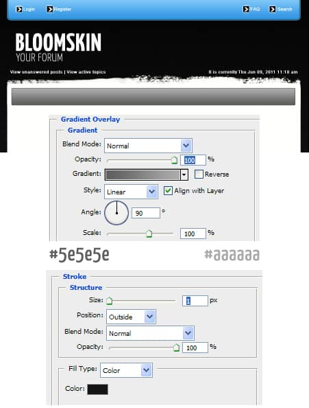
9. Get the line tool, and draw a line while holding down the shift key, make the line a light grey colour to give the bar a 3d effect.

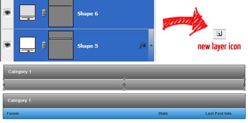
10. Holding down the ctrl or shift select the 2 bar layer and drag them to the new icon layer to duplicate. Select the duplicated layers and move it down. Press ctrl+t to make them transformable, by doing this you can edit the size of the second bar. I’ve changed the colour of the second bar by changing the settings in blending options.
Write out some details on the bars.
11. Using the rounded rectangle tool draw a second box like below, place the box underneath the 2 bars so the top is hidden. I’ve made the second box a light grey, with a dark grey stroke (in blending options).

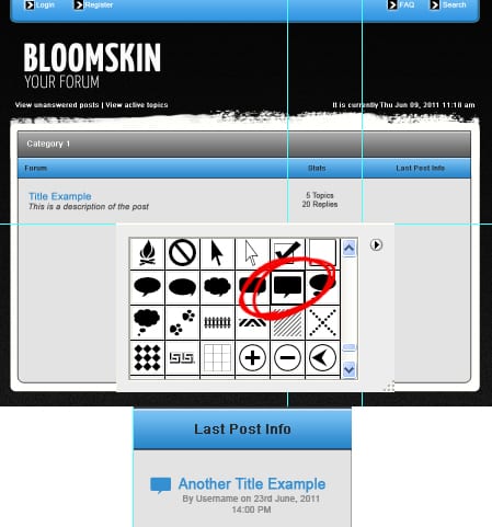
12. Drag out the some guide lines to lines up the posts. Write out some post examples using the font Arial. For the final details I’ve gotten a Comment Box shape from Custom Shapes and place it with the info.
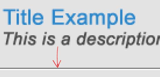
13. Using the Line Tool draw 2 lines across the 2nd box while holding down the shift key. Make one line white and the other a dark grey to give the post dividers a nice 3D effect.
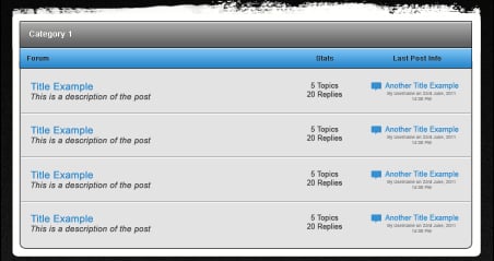
14. Duplicate the post example and post dividers using the previous method.
15. Draw a small button with the rounded rectangle tool & put in the same Blending Options settings as the top bar. Write out New Topic in Arial > Regular > 16pt > None.

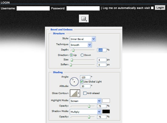
16. Using the font Arial and the line tool put in the Login section. Write out the example login using the font Arial > Regular > 14pt > Smooth and draw in the boxes using the rectangle tool, on the login button I’ve double click into blending options and put in the following settings:
17. Finally write out the Who Is Online heading (using the previous method) & example text & copyright text.

Final Result
