Designing for Children: Website Tips & Trends

Designing for children may seem like a daunting task. After all, you haven't been a child for years, and the world seems like a much faster, more complex place. How can you possibly know what a child who grew up in a world linked by the internet would want in a design?
Luckily, there are professionals out there willing to share their top tips with the rest of us. We found two experts' top tips, and we've outlined them below. With these ten tips, you will find designing for children becomes easier than you might expect.
Tips for the process of designing
David Mackintosh, author of Marshall Armstrong is New to Our School and man behind the look of Charlie and Lola, gave his top tips for designing for children to The Guardian. Those tips looked at the process of designing, from idea generation to design completion.
1. Keep a notebook, and constantly play around with pencil and paper.
You never know when an idea might strike, Mackintosh said. That is why he always keeps a notebook on hand and why he plays with illustrations, designs and other ideas on paper before putting anything permanent down. So keep plenty of notebooks and pencils on hand, so you can let your imagination run wild before you start creating your designs.
2. Plan out how your ideas will work in your format.
The size of your website, book, app or whatever else you are designing will have a big influence on your design. As such, you need to start your design by mapping out the exact size of your design. Then you can think about how the words and images will fall in the layout.
Create a map, whether it is a storyboard for a book or wireframes for a website, so you always have the big picture on hand. Pin it up next to where you work as well, so you can reference it quickly when you need to.
3. Generate tonnes of ideas because your first idea probably isn't your best one.
For each element and part of the design, you should come up with idea after idea after idea. Mackintosh said he found it easiest to pick out which of his ideas really didn't work, then use the ideas that were left over to base his illustrations on. Similarly, if you generate loads of ideas and toss out the ones that definitely won't work, you're left with ones that probably will – and that probably weren't your first concepts.
4. Let the text and the design shape each other:
"Good illustrations extend and enhance the words, not just repeat them," Mackintosh said, and so many illustrators and designers will use the words of a story or a website to lead the illustration. But the design and illustrations should help shape the words as well. After all, if you can say something more powerfully in the design or illustration, there is no need to write it down in the words.
This tip is obviously much easier to do when you are both writing the words and creating the design, but it can also be done if you are working with someone. You will just need to be diplomatic when suggesting that words might need to be changed for the sake of the design.
5. Create a large-scale mock up so you can see what the final product will look like when you're nearly finished.
At the end of the design process, Mackintosh said, he liked to create a mock-up of the book he has worked on, to see how it actually reads when pages can be physically turned. Similarly, you should create a mock-up of whatever you're working on to see how it will look and feel when it is actually being used. Being able to look at a nearly finalised product will highlight issues with the design, the pacing of the story, the usability of your design or other such problems that you might have missed when you were working closely on the project.
Tips for the look of the design
Web designer Louis Lazaris wrote for Smashing Magazine, analysing the common features of popular children's' websites and drawing out some best practice principles for designs for children. From those best practices, we can see what designs for children should look like.
1. Use bright, vivid colour palates, and keep the design cheerful.
This tip is a pretty basic, somewhat obvious one. After all, most things designed for children are brightly coloured in bright or bold colours, and they feature smiling characters with upbeat body language. Still, it is worth pointing out that bright colours and happy designs generally appeal to children more than minimalist, restrained designs do.
2. The typography of the words can be used to emphasise the illustration.
Mackintosh had one major tip for the actual look of the design. Large type, he said, can indicate loudness or shouting or emphasise how small a character or thing is. In that way, the typography in designs for children have even more functions than it typically does.
3. Keep navigation simple and large. Speaking navigation bars are great for little children, too
Children are smart, but they do still need a bit of guidance when using something like a website or a toy. To that end, designs for children should have plenty of large elements that guide how the children should interact with them. For websites in particular, things like large, bright navigation bars that read out the title of a section when the cursor rolls over it are great for children, since many of them might not be able to read but can use a computer.
4. You don't need to adhere strictly to your grid.
When designing for adults, an adherence to the grid suggests reliability and professionalism. Children don't want that in their designs, however. That provides the designer with a fun opportunity to break with their grid in unexpected ways. Simply tilting one particularly important element can make a design much more eye-catching and engaging, keeping the child's attention much more effectively.
5. Incorporate natural and/or skeuomorphic elements.
Children can grasp new concepts pretty easily: that is why toddlers can often use an iPad before they can walk well. Still, they are able to grasp new concepts more easily when those concepts can relate back to something they know already. That is why so many designs for children use natural or skeuomorphic elements. When an image has a depth of field, shadows or an animal children are familiar with, they feel more comfortable engaging with the product.
It's similar to the response children have to renowned cartoon characters. Because they associate the character with fun, they associate everything the character appears on with fun, too. And the same thing happens with natural and skeuomorphic designs. Children bring the associations they have already made to the design in a more direct way than adults do.
These ten tips – five for process and five for the look – can help you shape all the elements of any design you create for children. Just remember the most important tip: if it makes you feel like a child again, it will probably be great for your target audience.
Website Trends
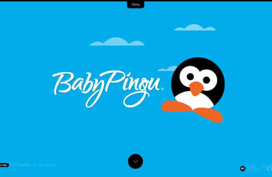
Baby Pingu
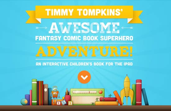
Timmy Tompkin's App
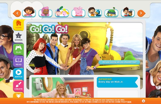
Go! Go! Go!
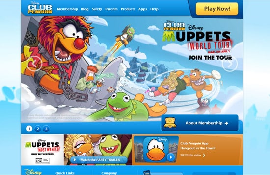
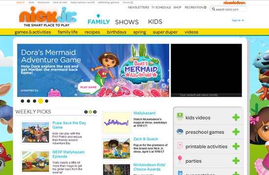
Nick Jr.
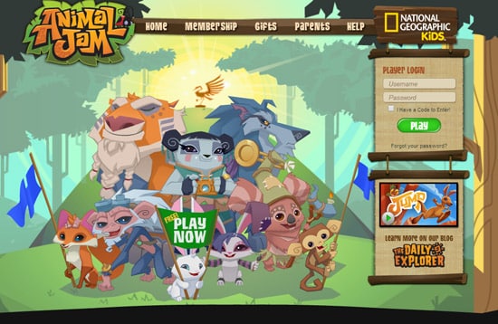
Animal Jam
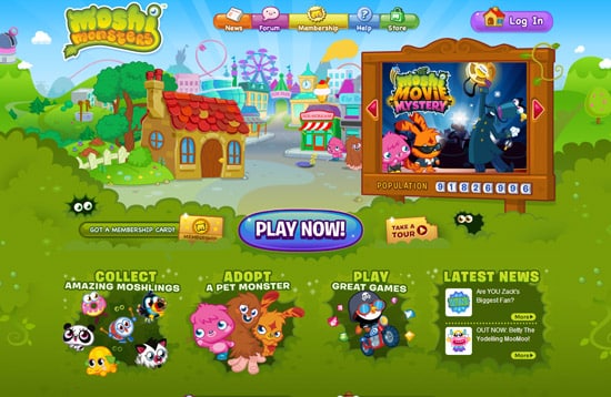
Moshi Monsters