Mobile App Design: Mistakes
Regardless of what kind of application you are creating or just planning to create, design mistakes will lead to disastrous results. Modern users prefer to install apps that are cool looking, powerful, and designed for everyday use and with this can help mobile app design services by Halo Lab . In addition, users want the design to be aesthetically pleasing and easy to interact with. But there is one problem: as they approach completion of a project, many developers make gross mistakes in design and usability. This happens because they understand how everything works, but they don’t think about inexperienced users. Therefore, you need to be aware of some common mistakes that can “kill” an application that took a lot of time and effort to create.
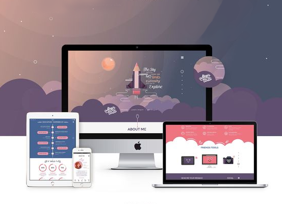
Good impression
A well-designed app makes a good first impression. It would seem that everyone knows this anyway, but no. If users do not like the design of the site where they can download the application, or they are unhappy with its appearance after downloading, then most likely they will not use it and will soon delete it. Therefore, it is imperative that the app makes a good first impression.
The first screen should load as quickly as possible and the application interface should be intuitive for users. At the first stage of interaction, you also need to remind the user exactly what the application is intended for and for what reason he installed it on his smartphone.
The interface should be such that all actions are performed effortlessly, and all controls are in plain sight. All this should fit into the overall design concept – the application should have a single visual style and harmoniously blend with the existing content.
Hints and Messages
All users interacting with the application make mistakes from time to time. Therefore, a good designer first of all thinks about how to reduce the number of possible errors. This goal can be achieved through visual communication with the user.
Any application should have a lot of visual cues that will help the user understand what actions he needs to take, where exactly he needs to touch the screen and what will happen after the action. In order to visualize all the important information, you need to remember three important things:
* Color: Bright colors are eye-catching, so they should be used to make the controls stand out
* Space: Design should be such that there is enough free space around the key elements so that they are easier to find. Also, the presence of free space eliminates errors when touching
* Typography: it is better to use simple and readable fonts, also do not forget about the size – the font should be such that all tips and messages are clearly visible.
Messy design
The biggest drawback of many apps is their sloppy and cluttered design. A designer makes a big mistake when trying to fit as much as possible on one screen, be it a game, a tool, or a news feed. We need to forget about this.
Apps are used on devices with small displays. Trying to put as much information as possible on the first screen will simply confuse the user. When designing, you need to think of each screen as a separate container for one element. When moving to the next screen, you need to give the user the next piece of information. People will gladly swipe and scroll if the content of the application seems interesting to them. And if the design is clean and understandable, then the chances of success increase significantly.
Small touch elements
The area of the fingertip is large enough that items that are too small or too close together can create problems for users.
You need to make sure your design has enough free space around every important element to eliminate accidental clicks. There is no secret formula by which you can deduce the ideal size of an element, but when a mistake is made in the design, the developer will find out during testing.
Here is one way to solve the problem – you need to test the design on a user with big hands. To do this, you need to draw a circle corresponding to the size of the pad of the index finger and in the future be guided by this data. The button may not be that size, but the responsive area should be that size or even larger.
As a result, all key controls will be comfortable for most users and the design will be more user-friendly.
What seems obvious to the designer may be completely incomprehensible to the user. This must be remembered at all stages of the design. Not all developers try to look at the design through the eyes of an ordinary user, which sometimes gives rise to mistakes.
Do not forget to turn to professionals halo-lab as well to get the perfect result.


