5 Web Design Tips to Highlight Your Brand in 2021

The days of creating a business website and getting it to the first page of Google with little effort are, unfortunately, fading into the past. You’ll need to do a lot more to gain online visibility these days.
Following the right web design practices can help you stay ahead of the competition in the online world. But with digital marketing trends constantly changing, it can be difficult trying to keep up with what works regarding website design.
Luckily, we’ve compiled a list of tips that can help you improve your website’s user experience, get more traffic, and convert more visitors as we move into 2021.
Create a Powerful Visual Hierarchy
It only takes about 3 to 5 seconds for users to get a first impression of your site. Having a clear message on your website’s first pages is, therefore, crucial to driving conversations. Find out what you want your audience to do, and emphasize that message.
It doesn’t matter if you want readers to contact your business, sign-up for a newsletter, or visit your business location; you should always try to highlight your key message.
Having a well-designed visual hierarchy can help you get your message across. Visual hierarchy, in simple terms, refers to a method of designing your most important elements in such a way that they attract your readers the most.

On top of encouraging readers to explore your website, it helps convince them to purchase your product or service, driving more conversions in the process.
Basically, visual hierarchy involves the following:
- Size: Bigger elements are the first things users see.
- Repetition: Something that is repeated sticks in a reader’s memory.
- Color: In contrast to drab ones, bright colors highlight the most important parts of your site.
- Alignment: Adding more space between a site’s elements helps attract more attention.
Add White Space
Like many other business owners, there’s probably a lot you need to say about your brand. It can be tempting to fill every inch of your site with information. After all, your readers will understand your product more, right? The sad truth is that you’ll accomplish the opposite.
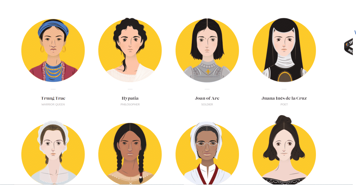
Readers may not enjoy reading your site if there’s very little white space. They’ll have a hard time reading text spanning their entire device’s screen. And if your content is difficult to consume, then visitors may flee your site in droves.

Source: RealHeroines
White spaces offer your reader’s eyes somewhere to rest, helping them focus on the most crucial elements of your text. Leveraging white space may, then, offer many more benefits on top of improved readability. Some of them include:
- Professional appearance: A site lacking any white space looks clunky. It often gives the impression that its designers stuff their pages with content without a plan. Design a site that reflects your brand’s professionalism by adding lots of space.
- Creates balance: Reading too much text can quickly become overwhelming to your eyes. You can achieve balance by adding some space to create places of rest.
- Improved attention: With very few distractions, your readers’ concentration may improve. Clutter makes reading content much more difficult, leading to reduced attention levels.
Note, though, that white space shouldn’t necessarily be “white.” Despite its name, it can come in other solid colors or blurred backgrounds. The most important thing, however, is that it needs to incorporate space.
When designing your site, keep in mind that white space shouldn’t have any elements that may divert your readers’ attention. Using consistent white space in all your pages can help prevent any distractions.
Provide Social Proof
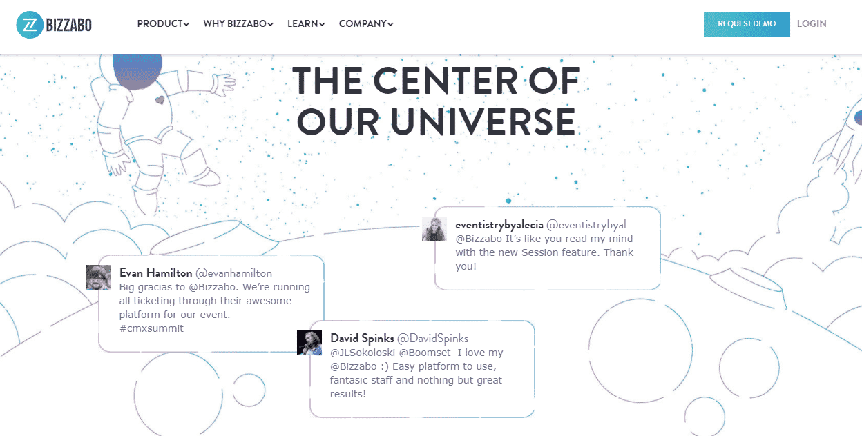
Many sites are quick to mention the benefits of their services, neglecting their social proof. To stand out from other brands, you need to provide some evidence why you’re the right choice for consumers. Show users that other customers trust you and love your services, and you may see your conversions increase.
There’s even a phenomenon that highlights why social proof is important. Known as “conformity bias,” it explains that consumers tend to follow what other consumers are doing. So, if visitors see that other clients are buying from you, they’ll be more likely to convert to paying customers.
That said, how can you prove to users that you offer better services than any other brand? The easiest way should be to provide testimonials. Make it easier for clients to leave testimonials by directly asking for them.

Aside from testimonials, other sources of social proof can include:
- Awards you’ve won. Display any industry awards you’ve received on your website, no matter how insignificant they may seem.
- Certifications you’ve received. A certificate showcases your proficiency in your field and gives readers the impression that they’re in safe hands.
- Endorsements from influencers
- Logos of respected media outlets that have featured your brand
- Product reviews from paying customers
Adding video content
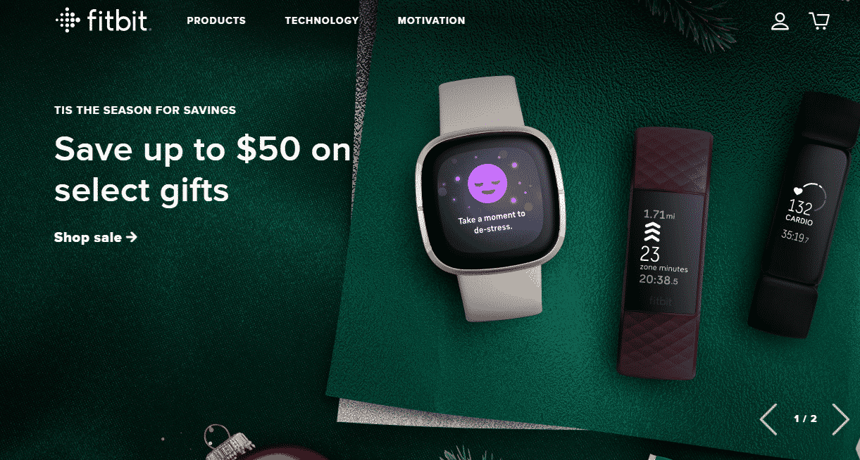
In a Hubspot survey, 54% of consumers stated that they loved watching video content from businesses they support. It’s no secret that users consume video content now than they’ve ever done before, and it’s a trend that seems to continue booming. Businesses who fail to shift from text to visuals risk being left behind, eventually underperforming among their competitors.
Source: Purple
Going to 2021, including videos in your content should be a no-brainer if you want to build stronger connections with your visitors. Video content improves user experience, helping your audience know more about your product in a fun, enjoyable way.
Many business owners don’t know, though, that focusing on a video content strategy can also improve their SEO. Your website is more likely to rank higher than other sites if it has valuable video content. In fact, in a recent Comscore study, sites leveraging videos were 53 times more likely to rank in the first pages of SERPs.
Having said that, you need to optimize your videos properly to enjoy the perks of visual content. At first, integrating your videos to get higher rankings can be a challenge.
That’s why you may want to enlist the services of a web design company to get the most of your videos. An experienced designer can help improve your SEO game by suggesting helpful content, identifying mistakes in your strategy, and optimizing your content.
Conclusion
The above hacks can give your company’s site an edge over other competing businesses. Used the right way, they can help reflect your brand’s values and bring more loyal customers.


